tigercoming
Visual identity
- C
- tigercoming
- AD
- Janine Sui, Nagisa Chen
- D
- Janine Sui, Nagisa Chen, Willie Liu, Heda Shi
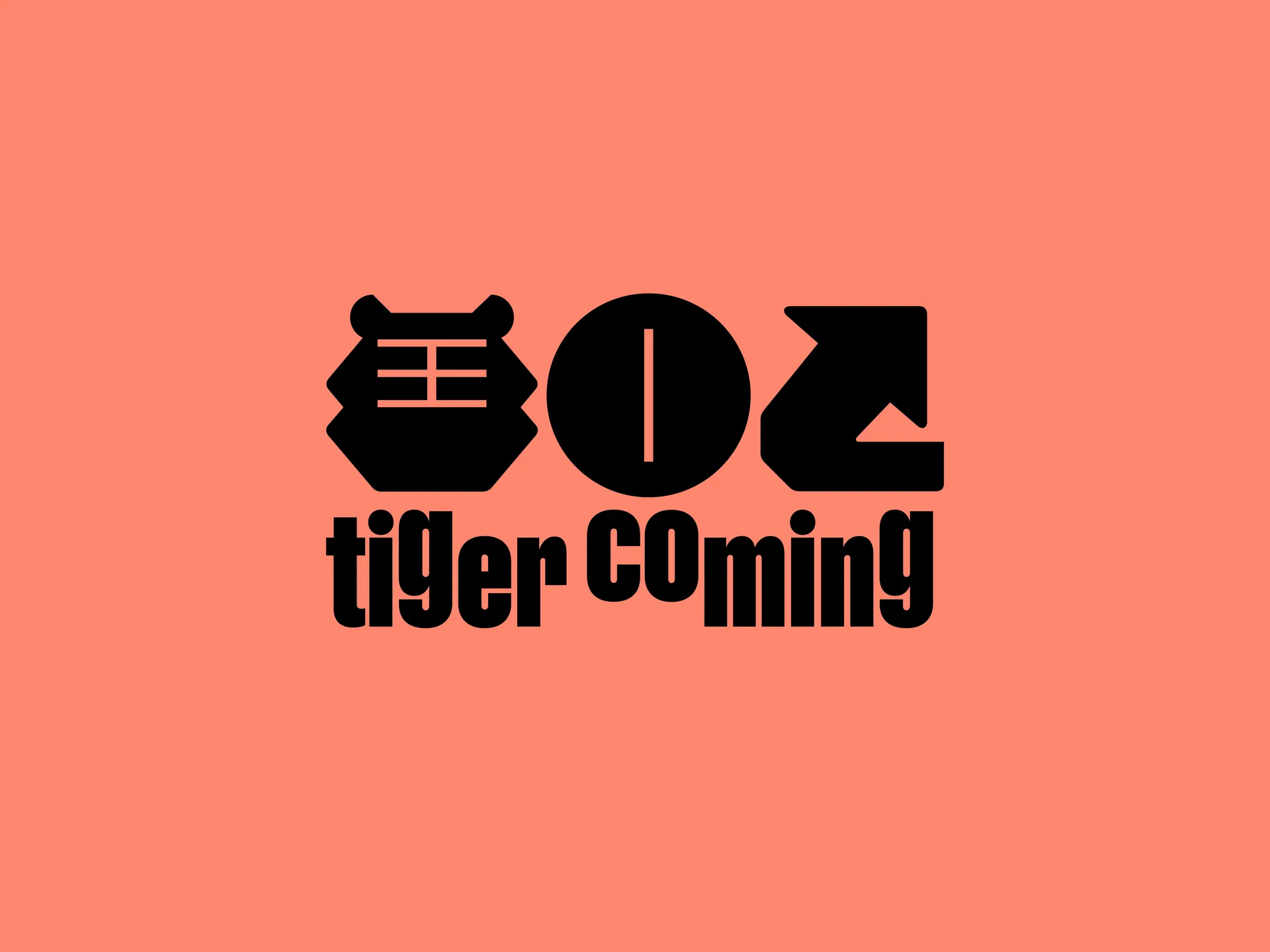
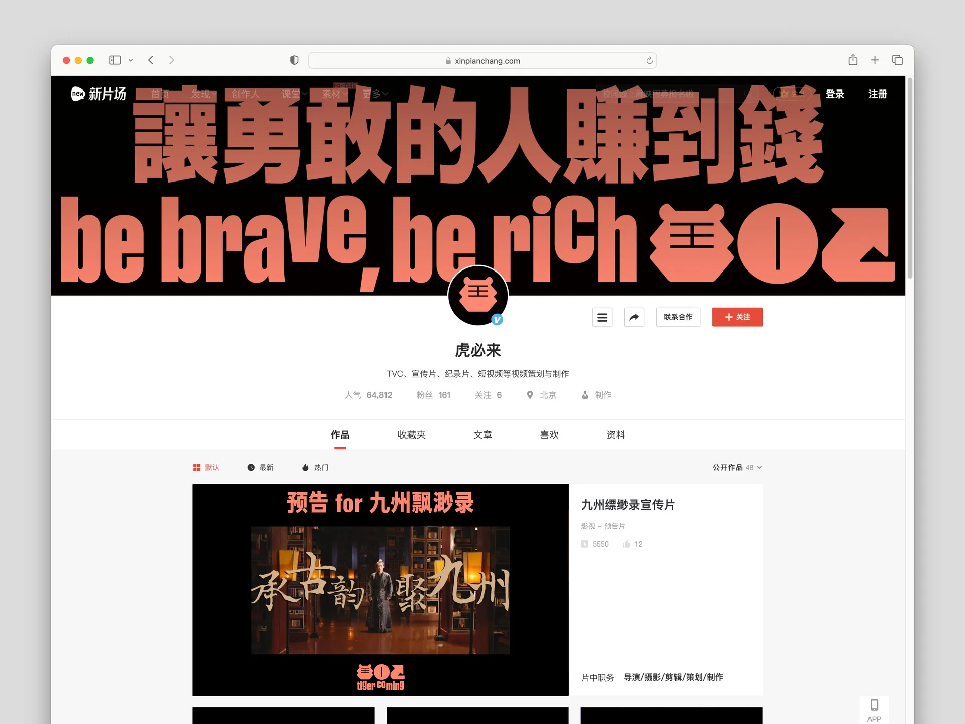
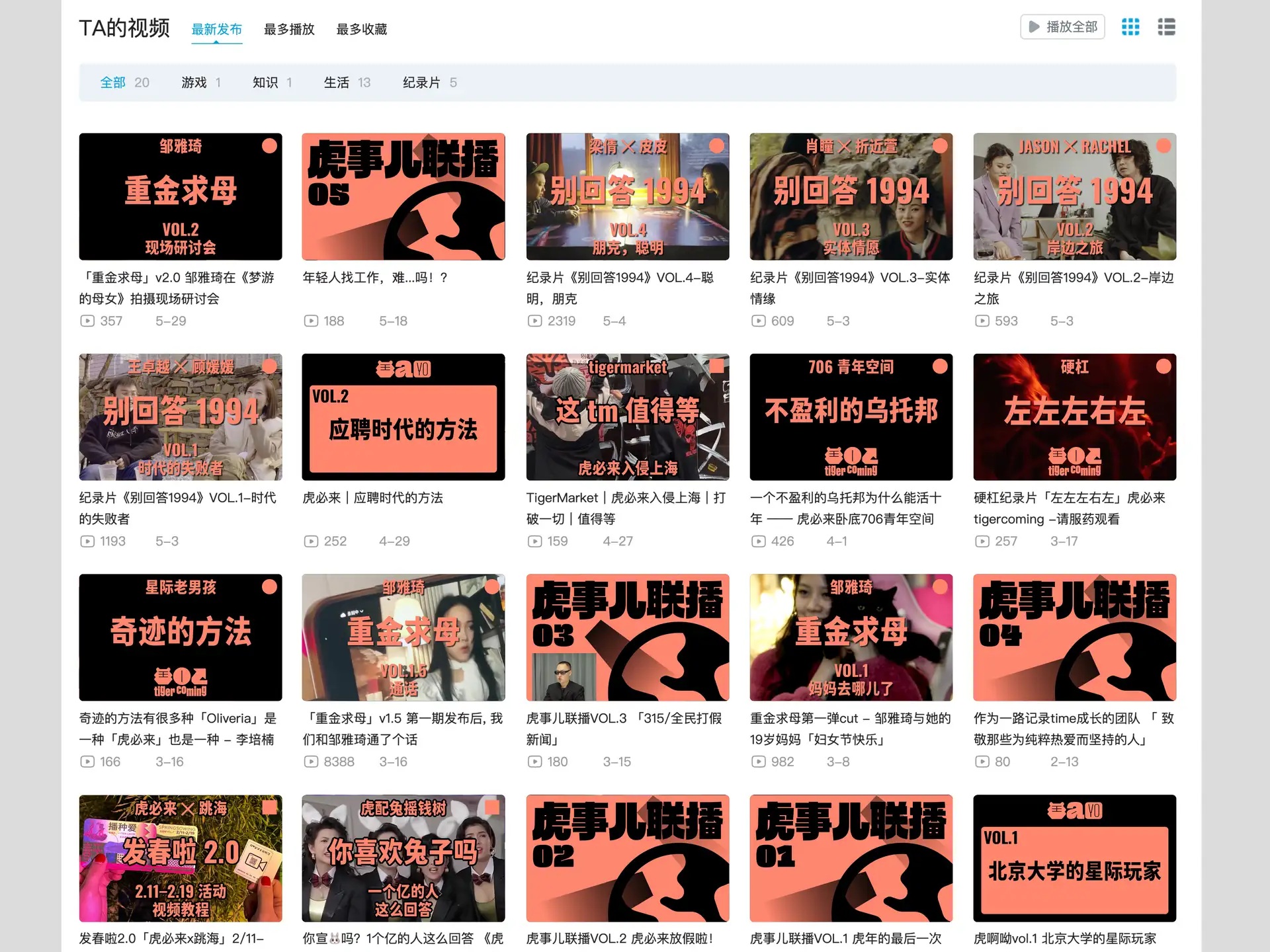
「我们创造可以勇敢去全世界的内容」——「虎必来」是一个成长中的内容创作品牌。
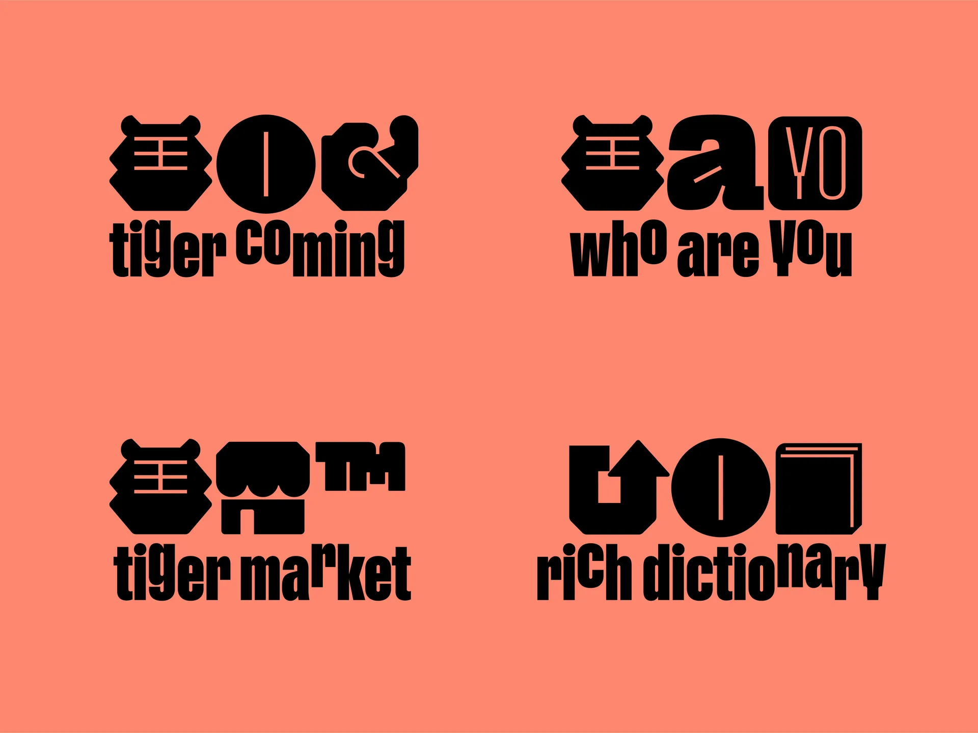
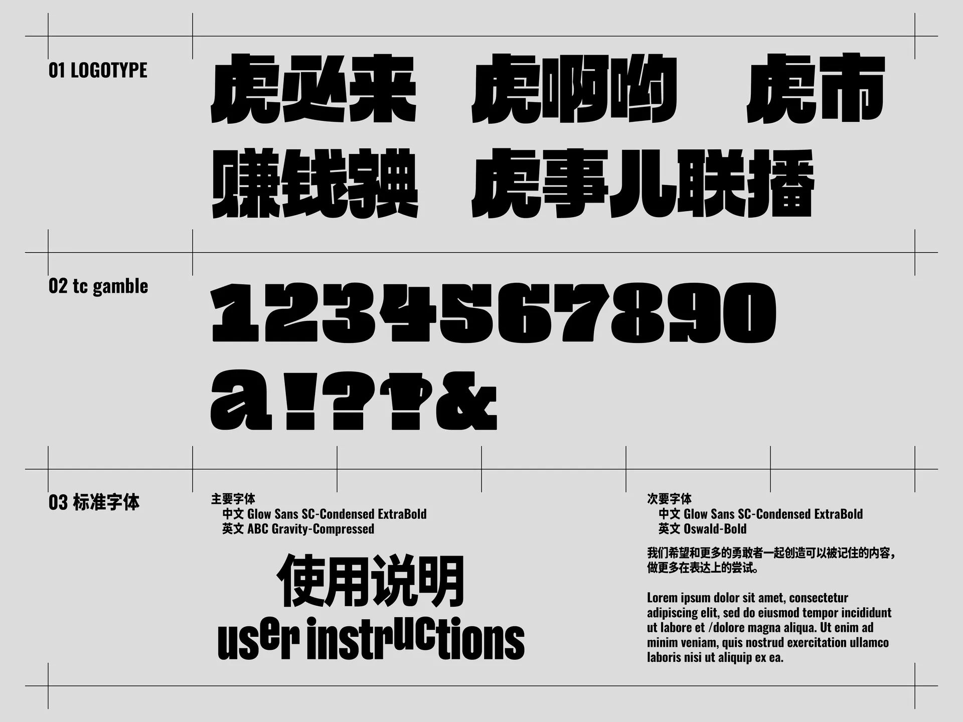
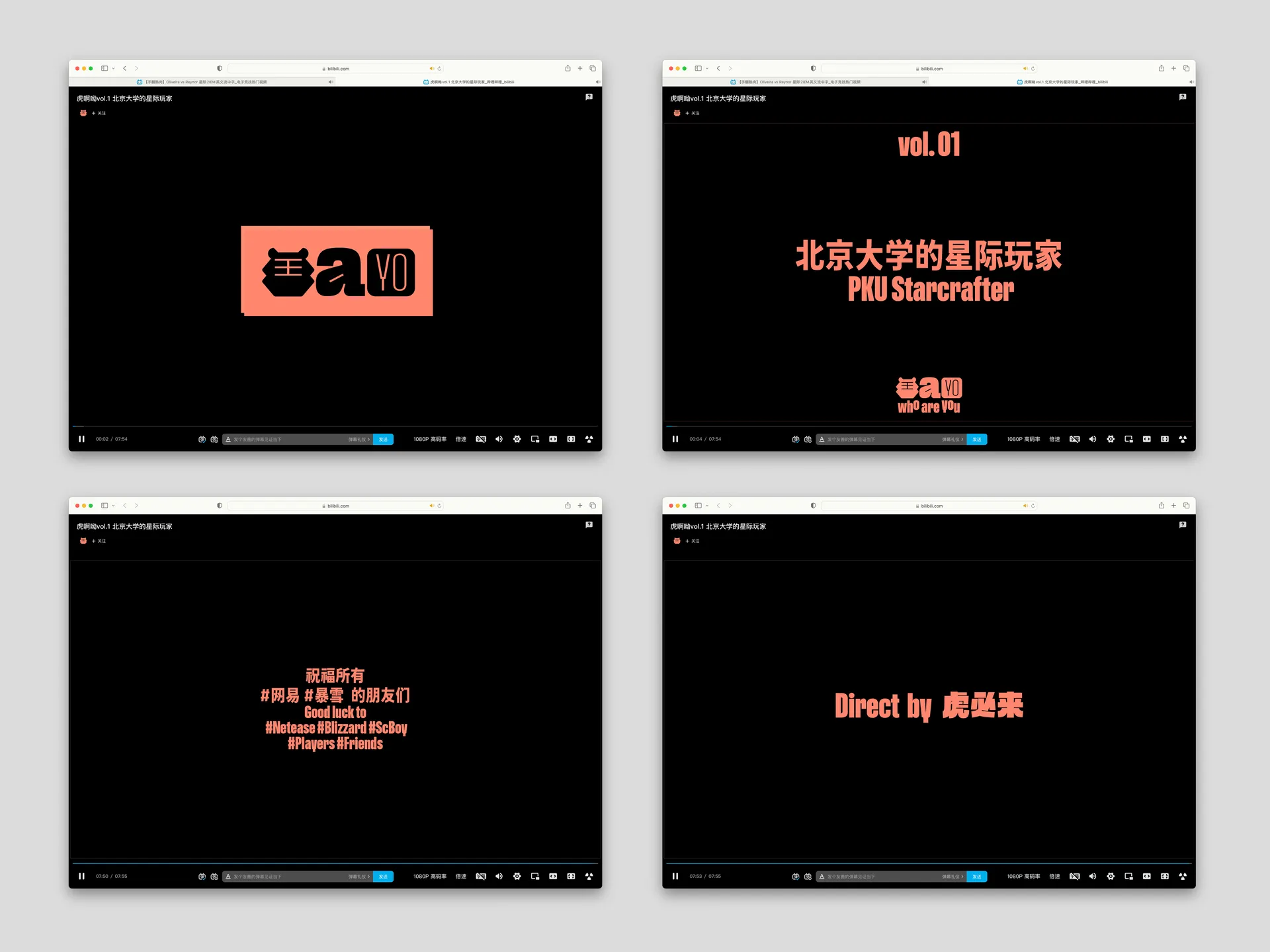
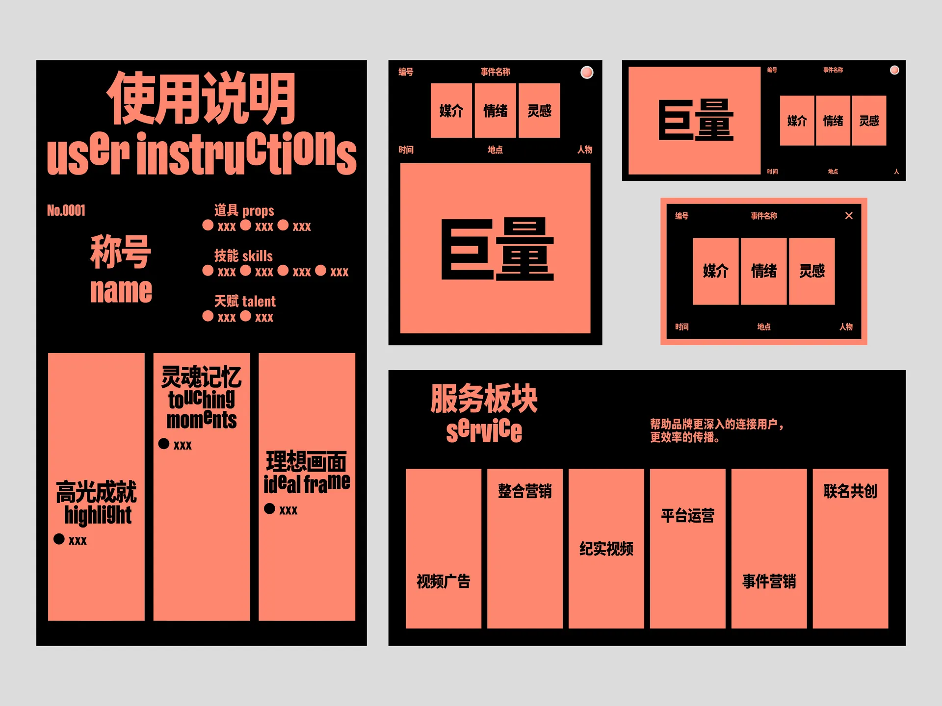
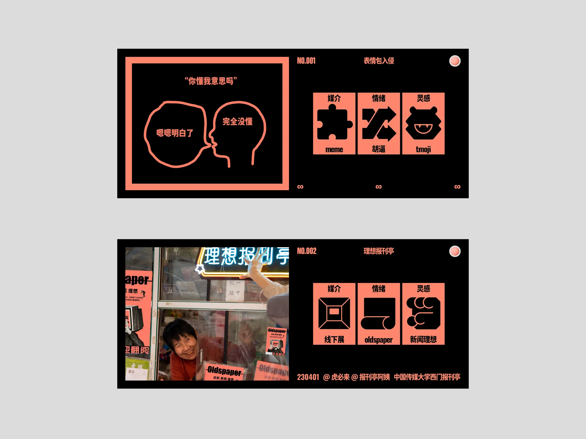
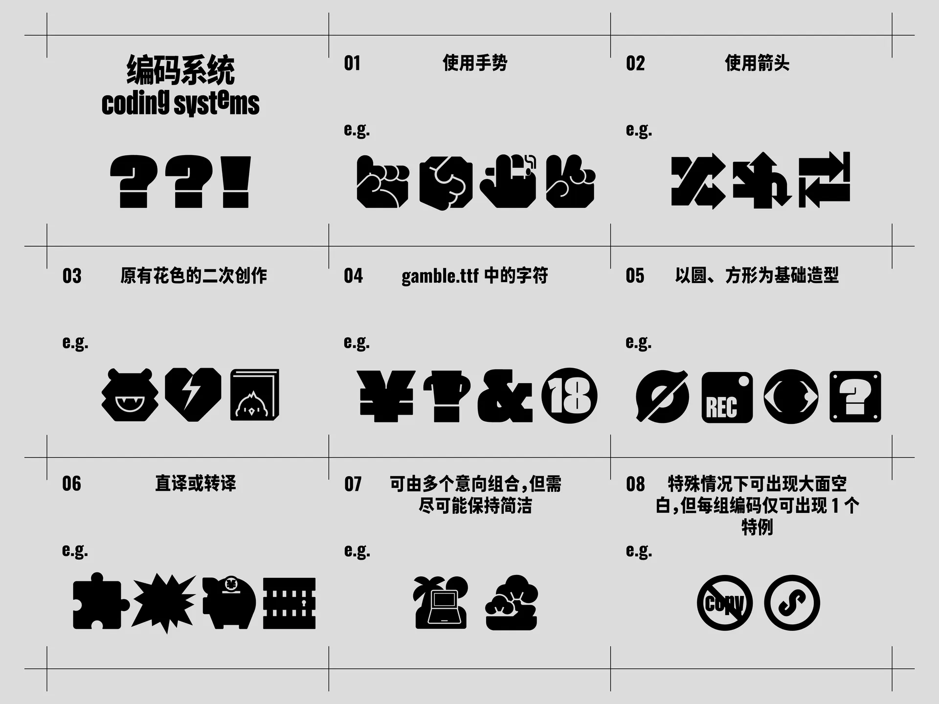
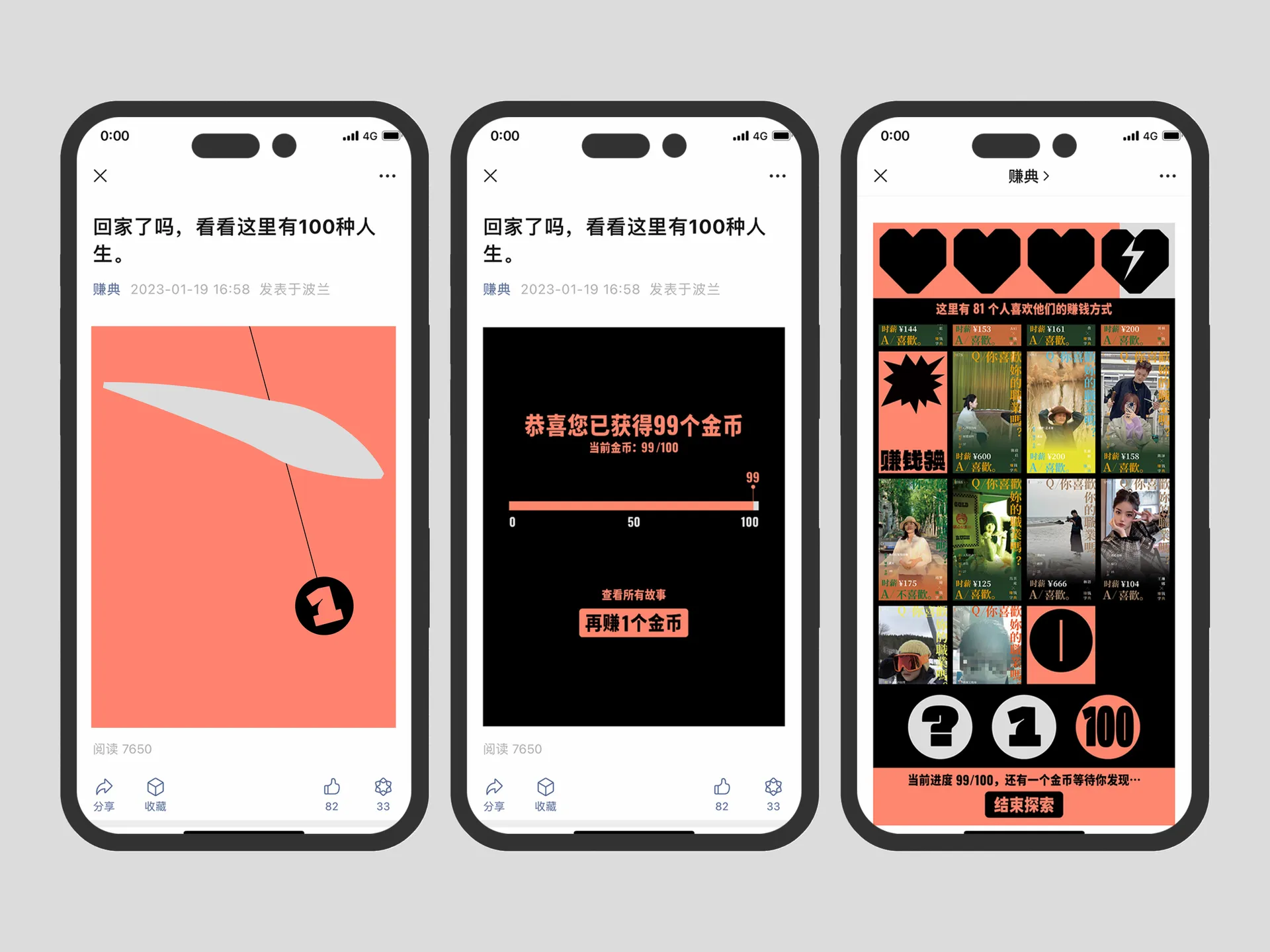
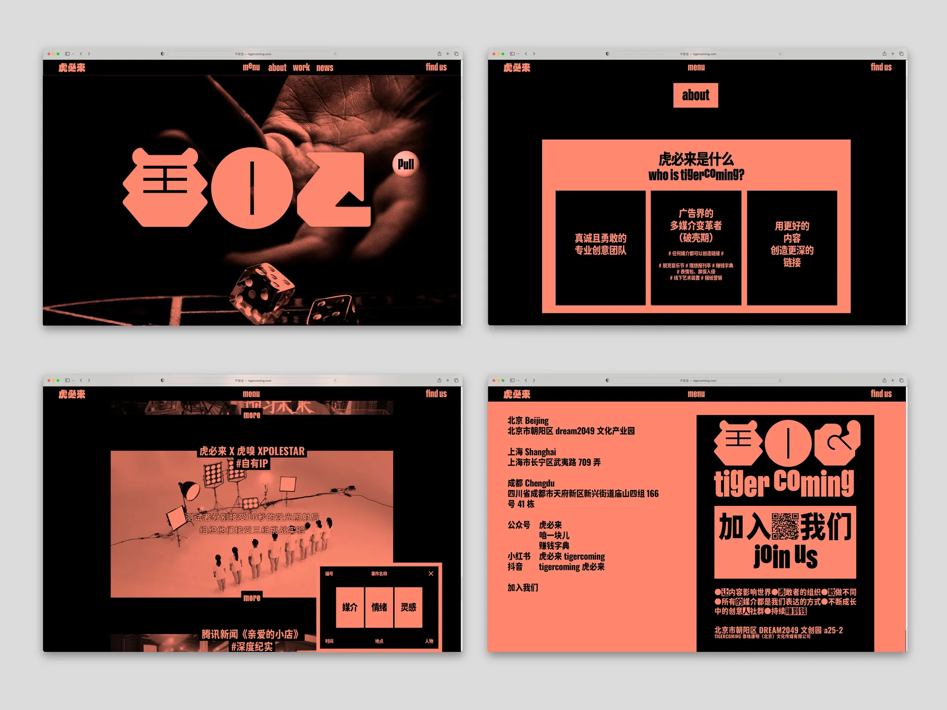
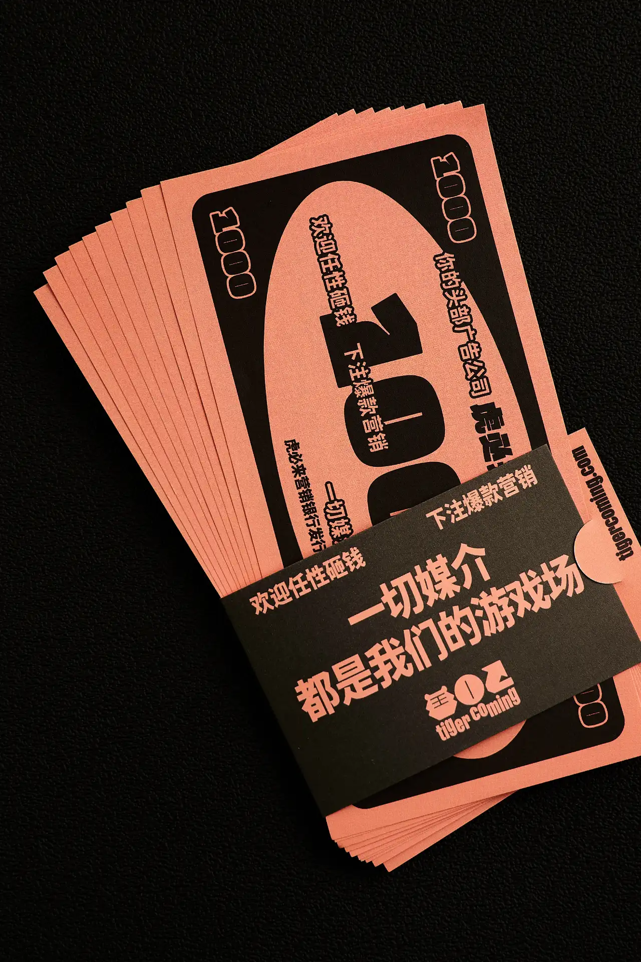
我们呼应品牌名称中的「虎」,从「老虎机」的概念入手,构建了一套灵活的视觉系统,诠释品牌「搏一把」的精神。我们对品牌中文名进行了直白的图形转译——滚动、定格、成形,再辅以基线可调的英文字体 Gravity,以可控的规则塑造了其胡乱、跳脱、不拘一格的品牌形象。我们将图形、字体、文字排印的负空间极致压缩,以到达「撑满」「紧绷」的视觉效果。
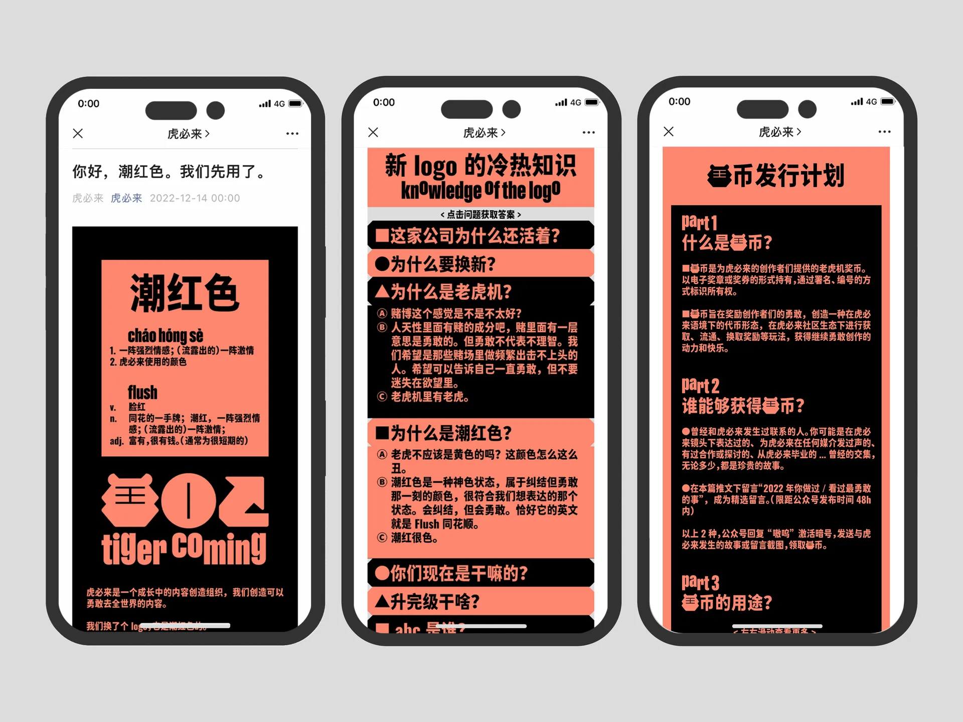
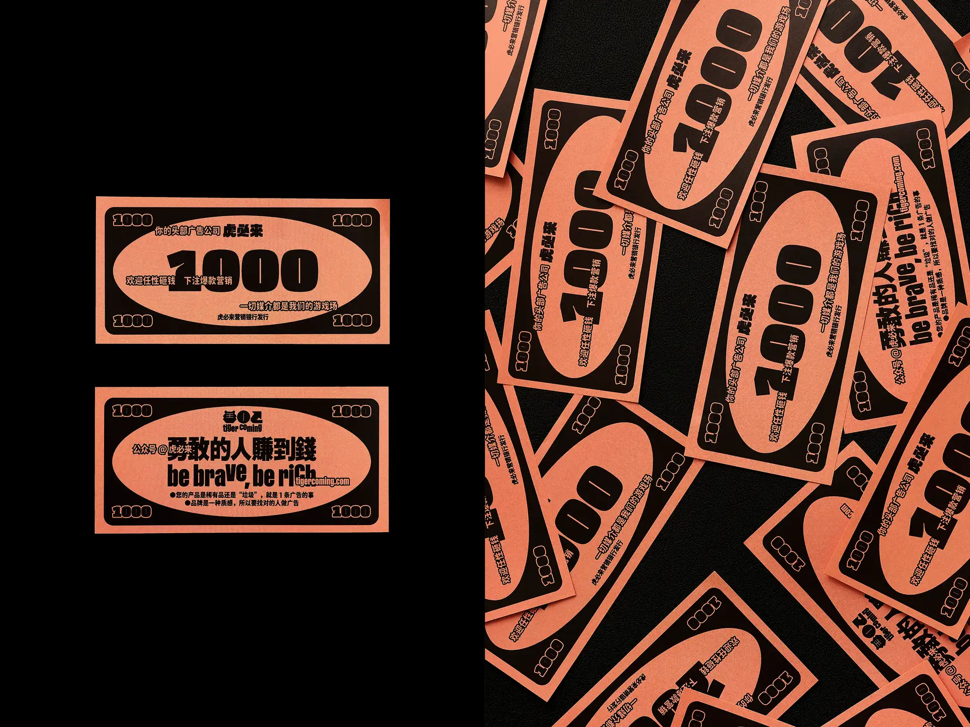
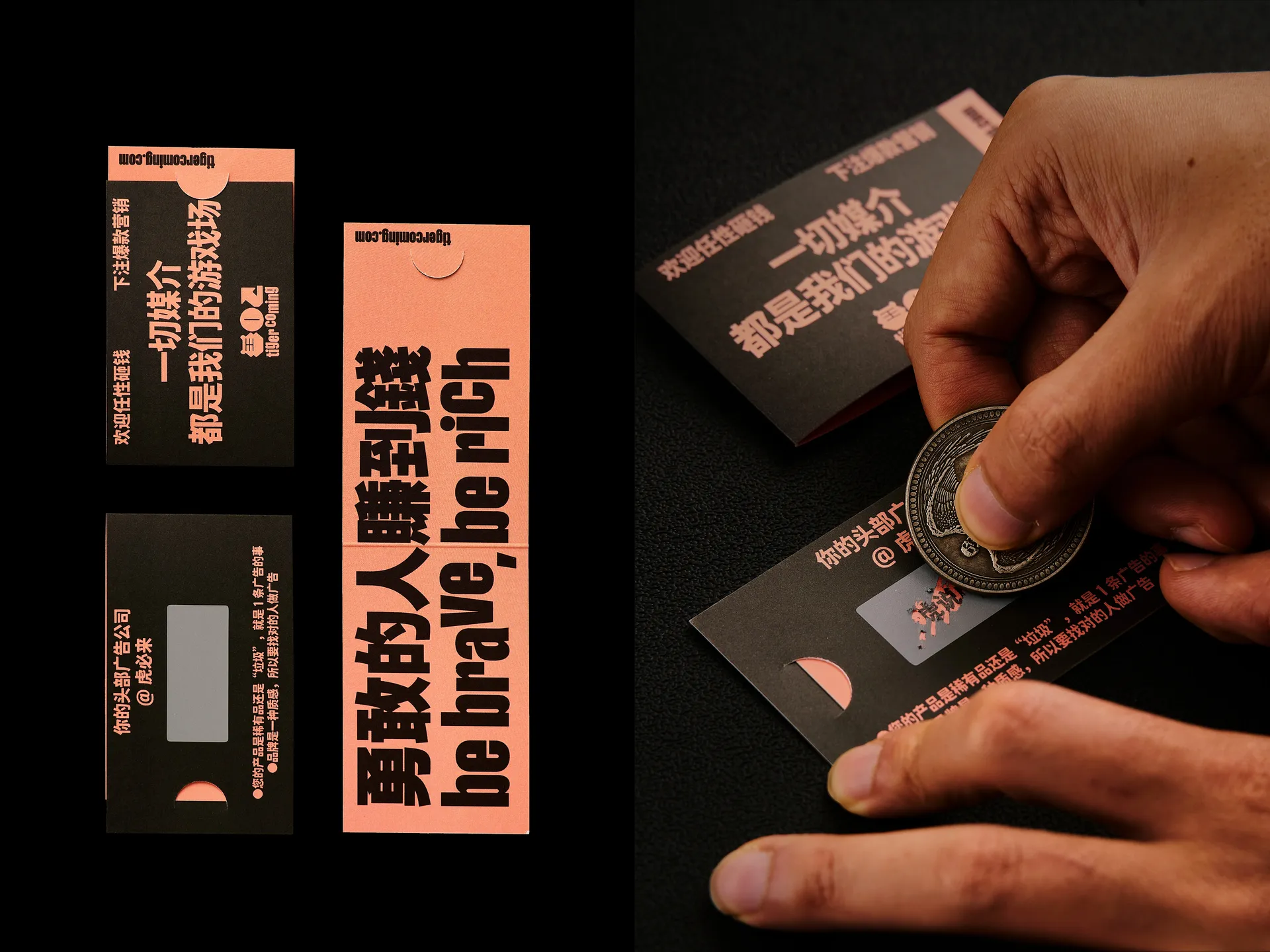
flush(「面色潮红」)是品牌色彩应用的核心概念,潮红与黑双色搭配,饱满充沛而张力十足。flush 是「潮红色」,也是「同花顺」——转到「虎必来」,就能获得头彩。
“We create content that can go fearlessly to the whole world” — “tigercoming” is a growing content creation brand.
In response to the word “tiger” in the brand name, we started with the image of “slot machine” (tiger machine in Chinese) and built a flexible visual system to interpret the brand’s spirit of “taking risks”. We translated the brand’s Chinese name directly into graphics, supplemented by the adjustable Latin typeface Gravity, to create a bold and unconventional brand image. The negative space of graphics, fonts, and text layout are compressed to achieve a “full” and “tense” visual effect.
“Flush” is the core concept of the brand’s color application, with a rich and powerful combination of flush red and black. Flush is both “flush red” and “royal flush” - when you turn to “tigercoming,” you can hit the jackpot.