Double Win
Visual identity
- C
- Double Win
- LA
- LxU
- TD
- Willie Liu
- D
- Willie Liu, Nagisa Chen
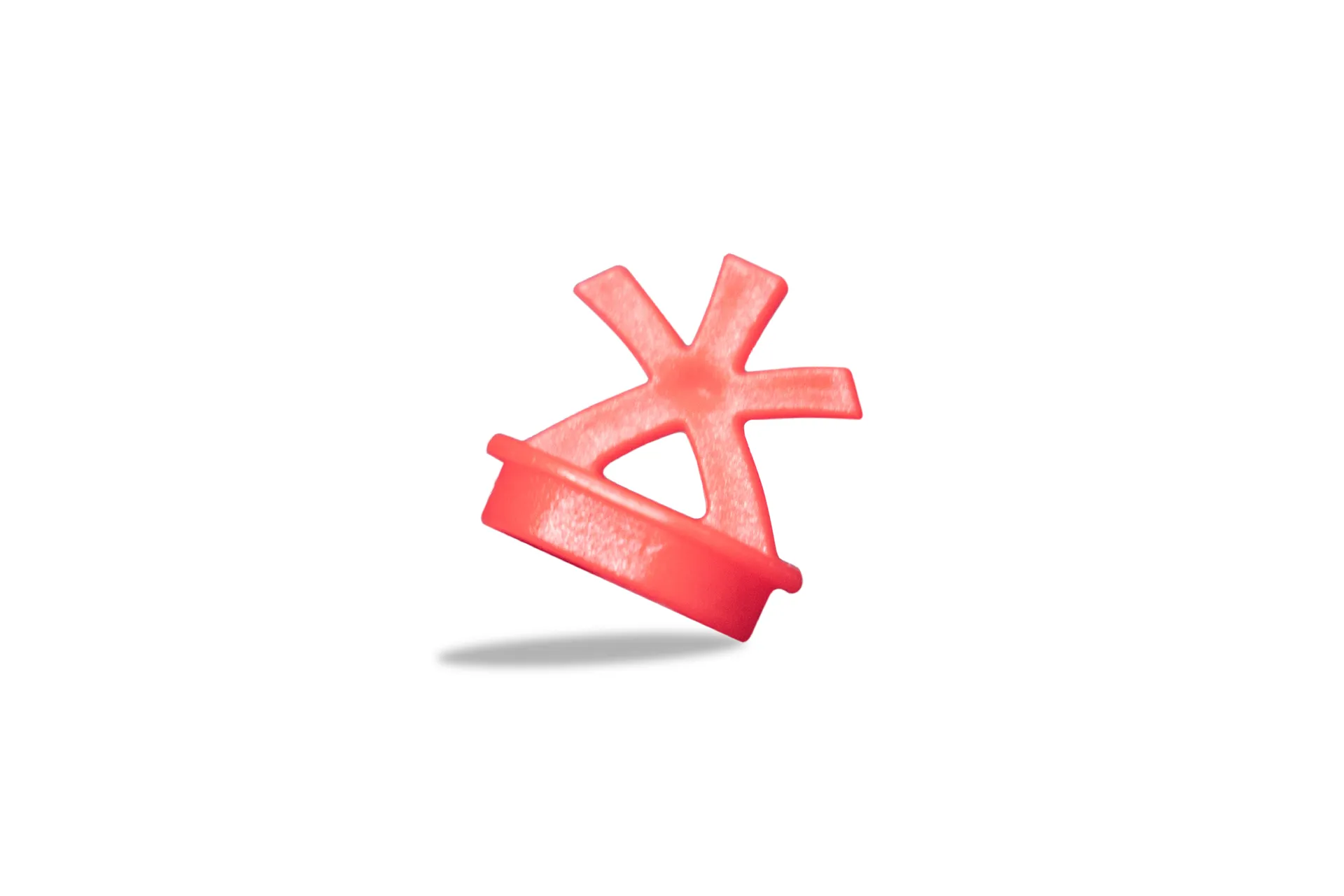
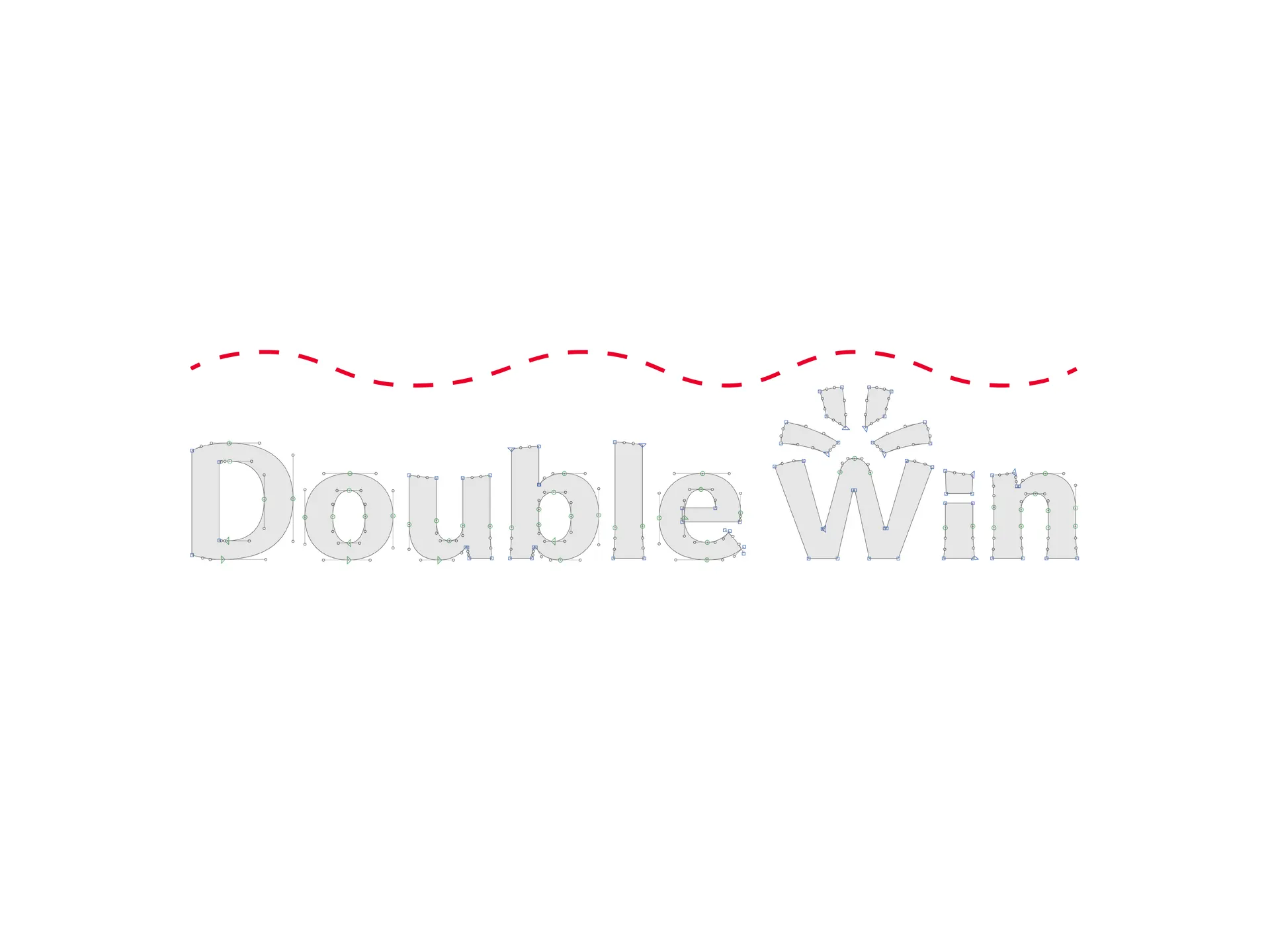
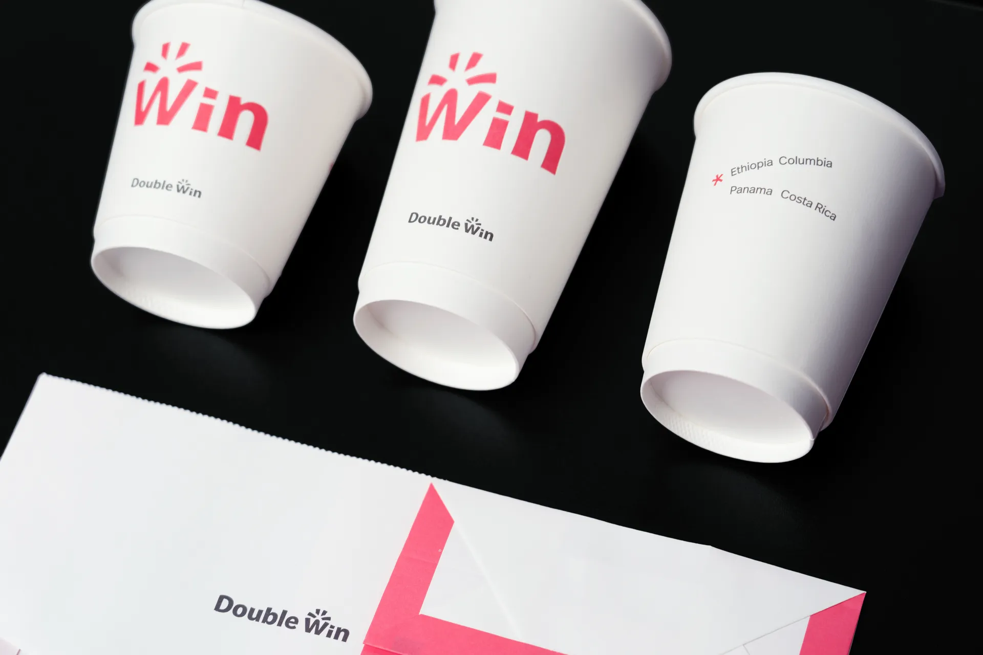
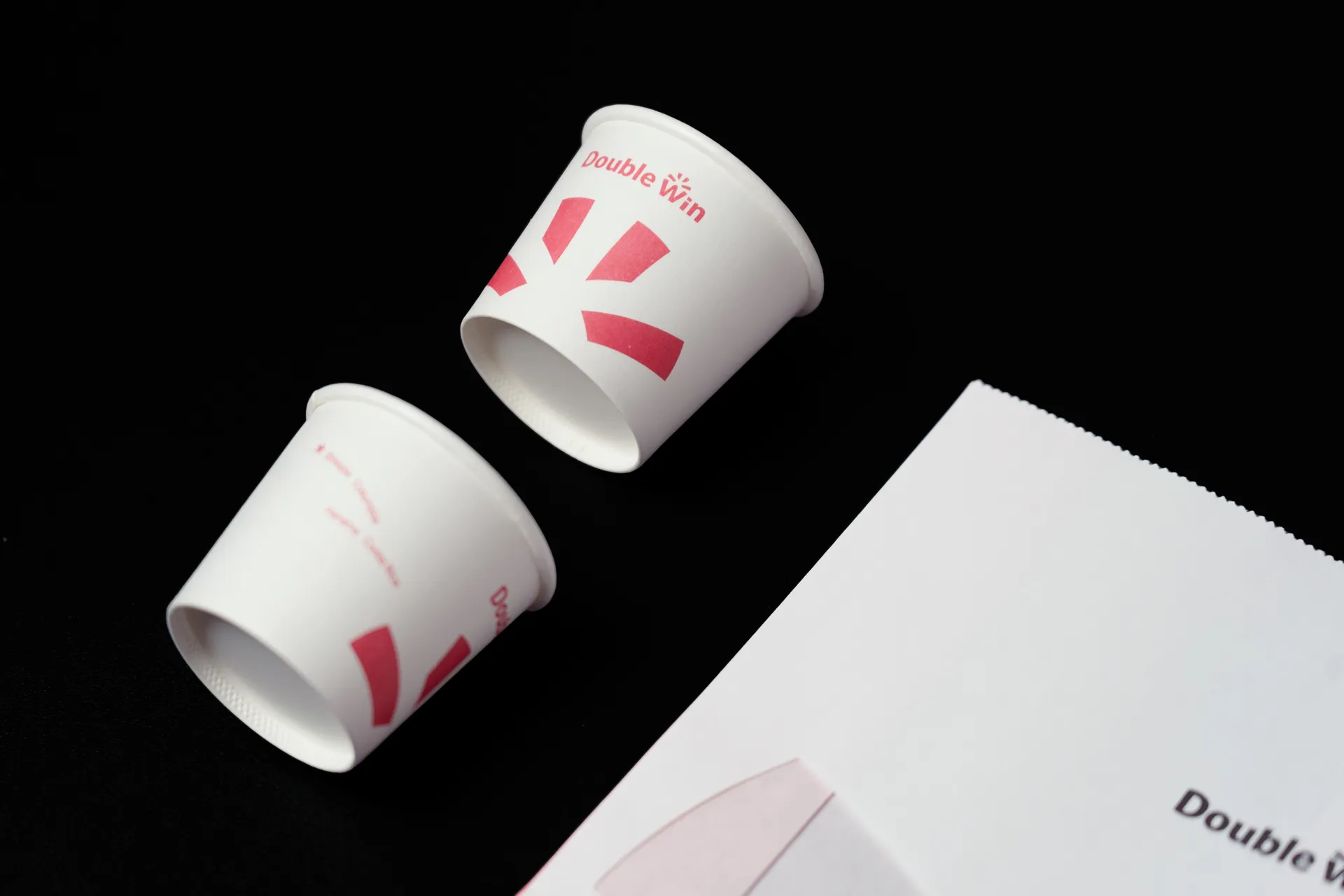
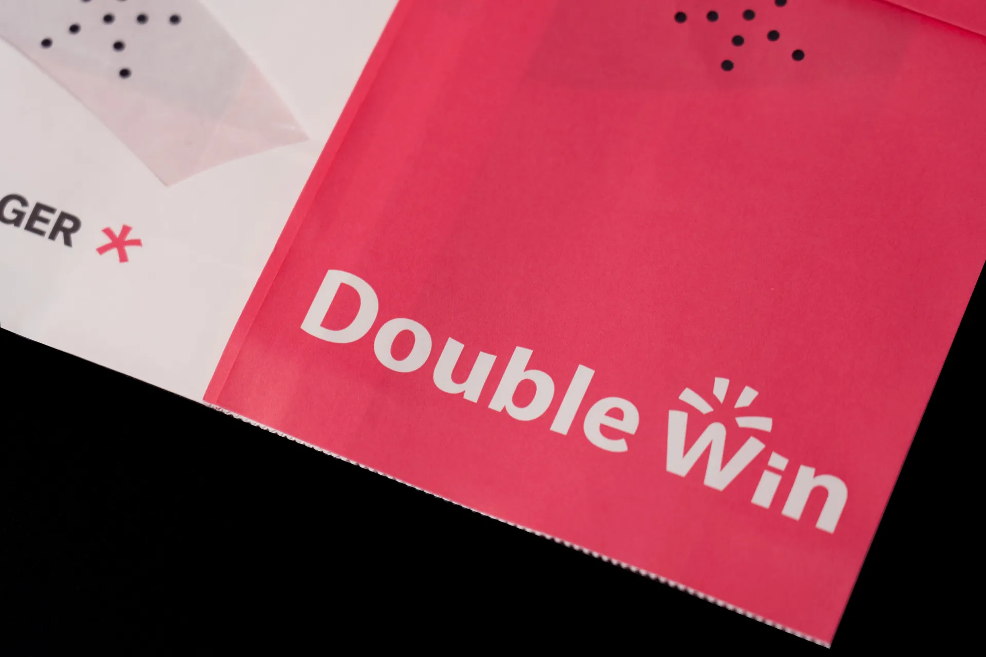
品牌与粉丝之间的互动,使品牌的昵称本身的变成了一个重要的记忆点。基于粉丝给品牌的昵称「大波纹」,我们将「大」与原有 logo 的设计中的「星形」提取出来,在 W 与「星形」组合的空间中创造出「大」的负形,将其视为品牌的图形识别元素,它既是 logotype 的构成组件,也是一个独立的图形。同时,我们将「波纹」作为整个品牌视觉系统中最具扩展性的元素推广到 logotype 的设计细节以及其他品牌视觉的字体排印设计中,为其增添了新鲜、活泼的气质。
The interaction between a brand and its customers plays an important role in brand communication. Based on the nickname “大波纹” (Big Ripple) given to the coffee brand Double Win by its ardent customers, we extract visual features from the character “大” (Big) and the star shape in its original logo, creating a negative shape of “大” in combination with the whites in “W” and the star above, the most crucial identity of the brand. Meanwhile we forward the idea of “Ripple” as the extensive element to the entire brand visual system, including wavy features in the new logotype and other typographic perks in graphics, adding a fresh and lively look to the brand.