Arcade Project
Visual identity
- C
- Arcade Project
- AD
- Nagisa Chen
- TD
- Willie Liu
- D
- Nagisa Chen, Chen Li, Janine Sui
- PD
- Pangolin Press
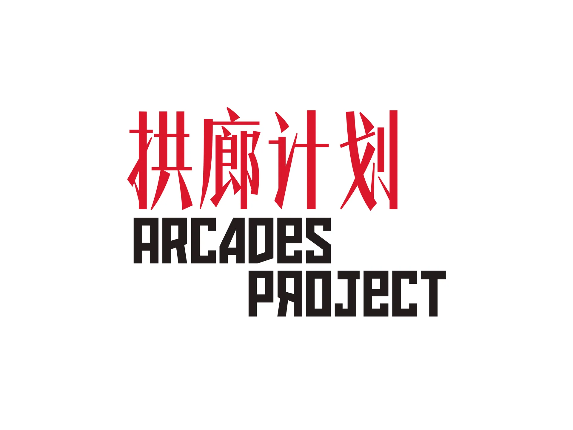
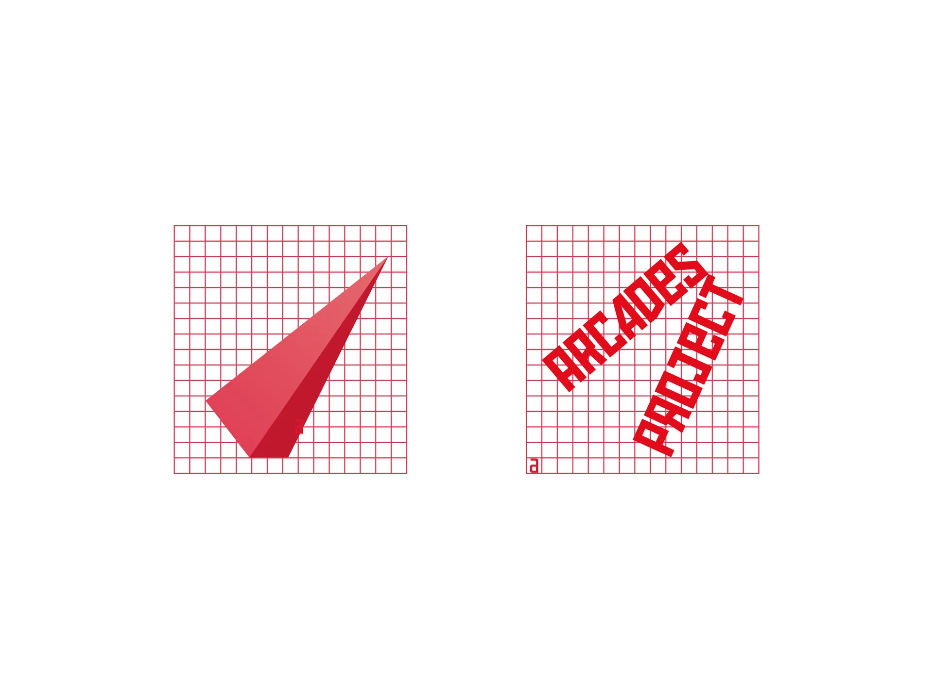
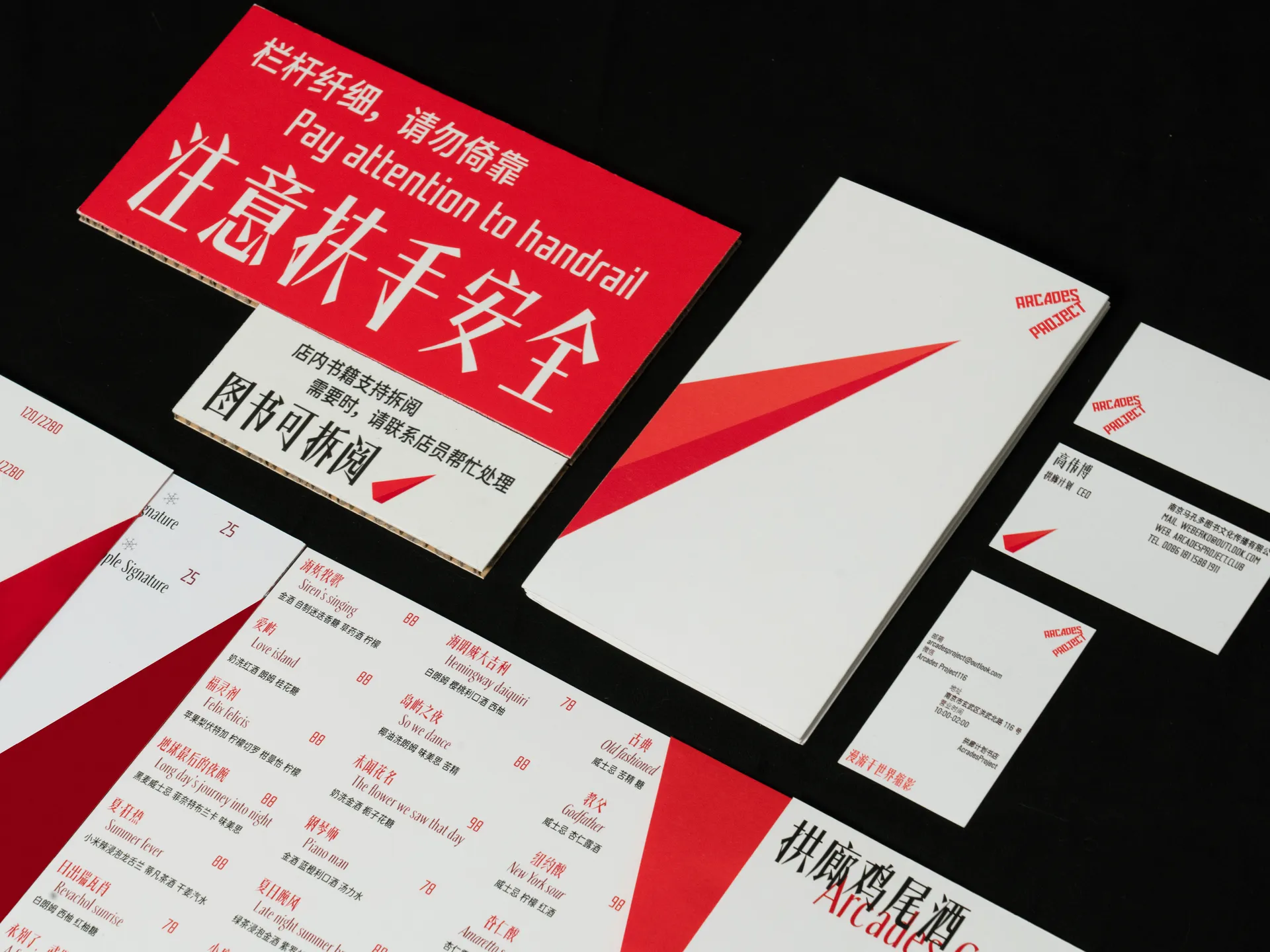
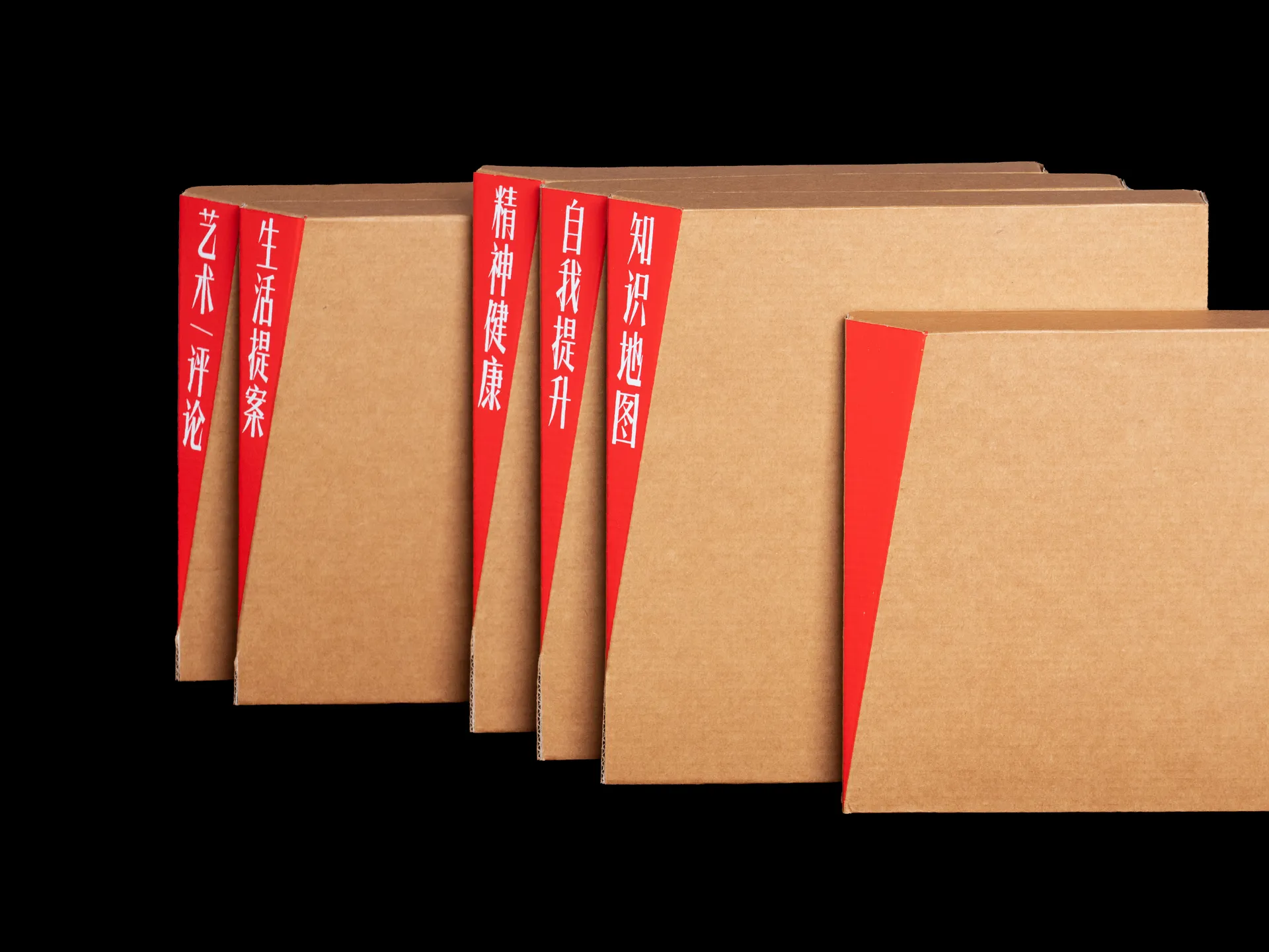
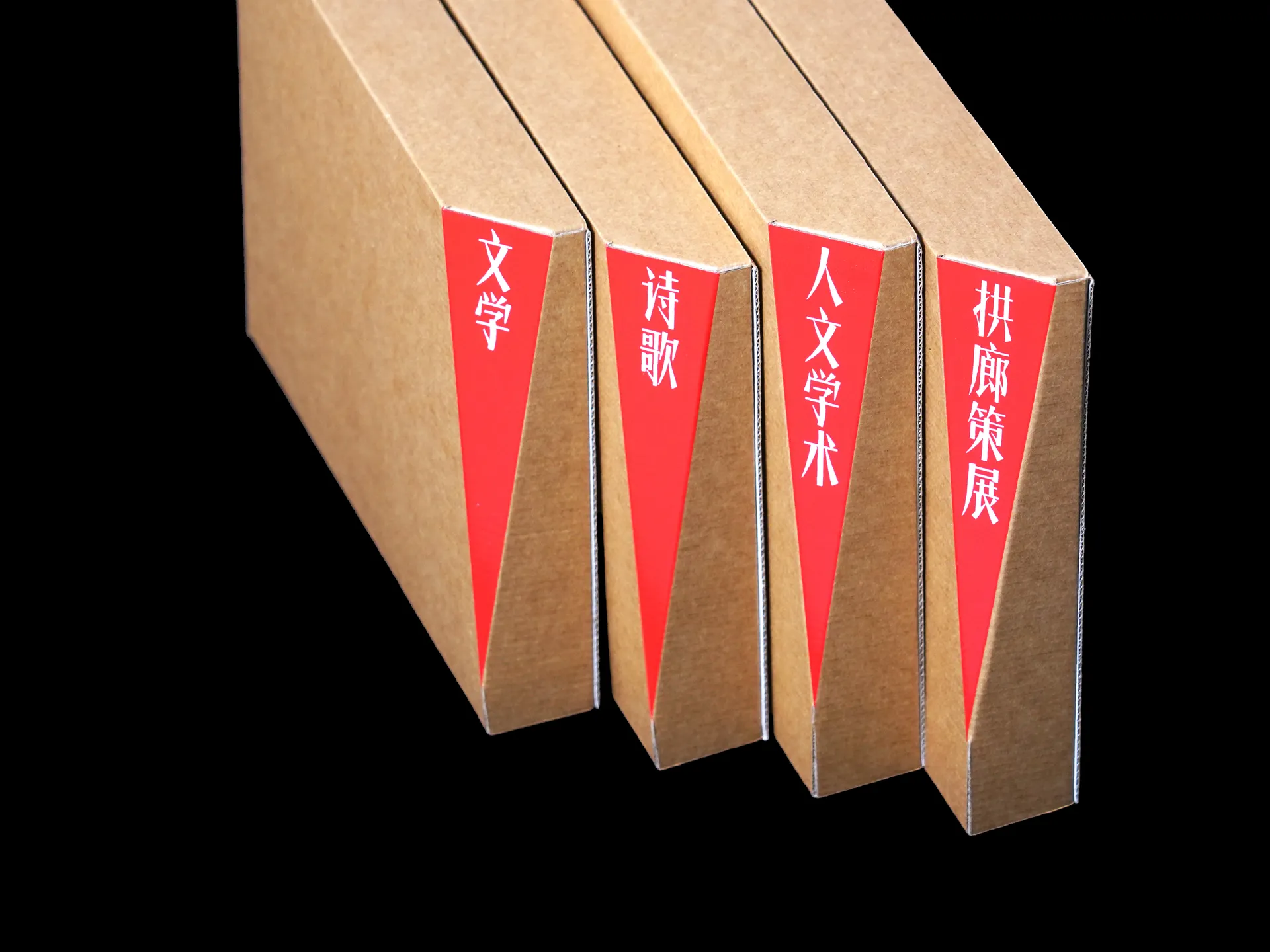
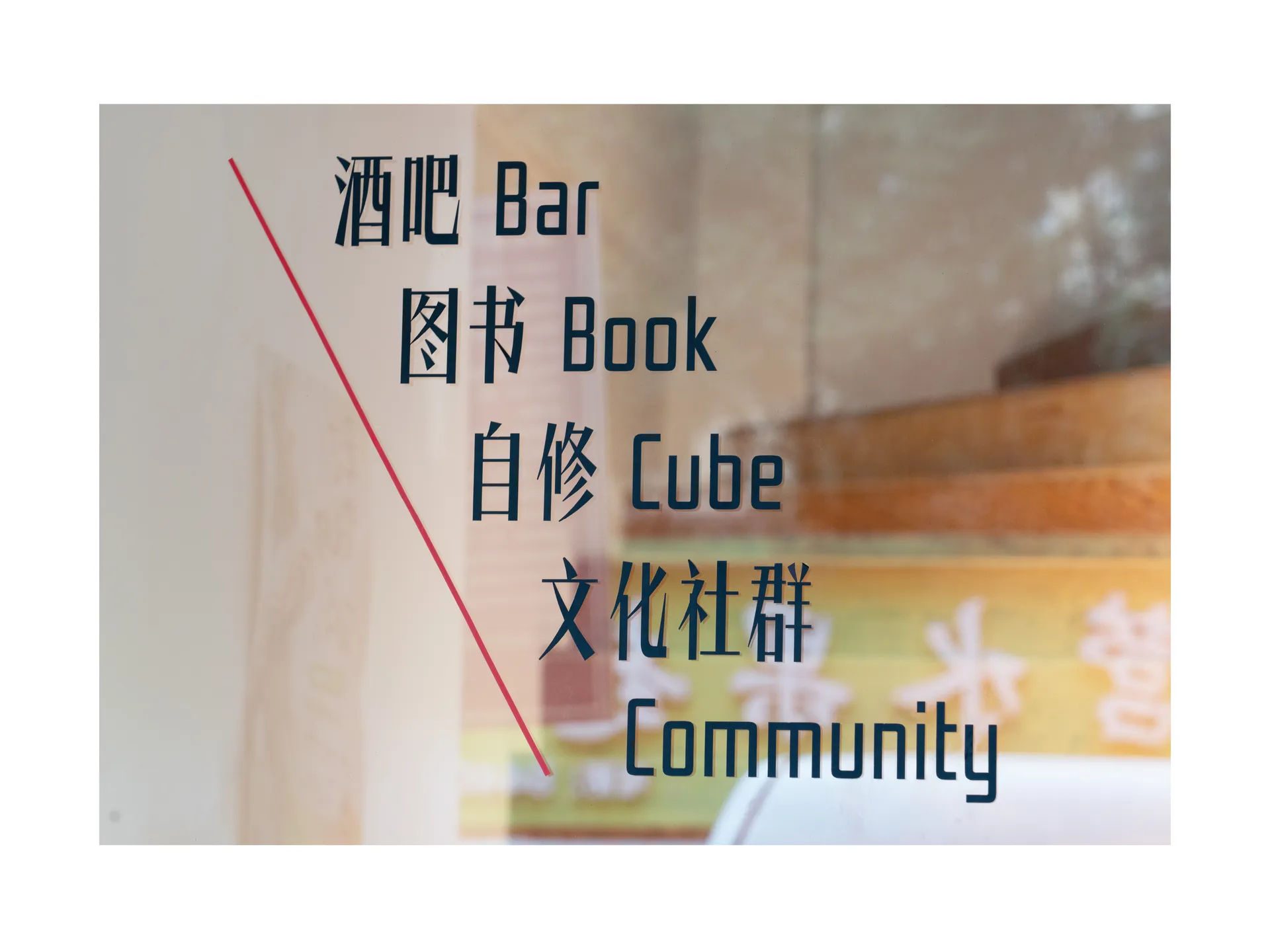
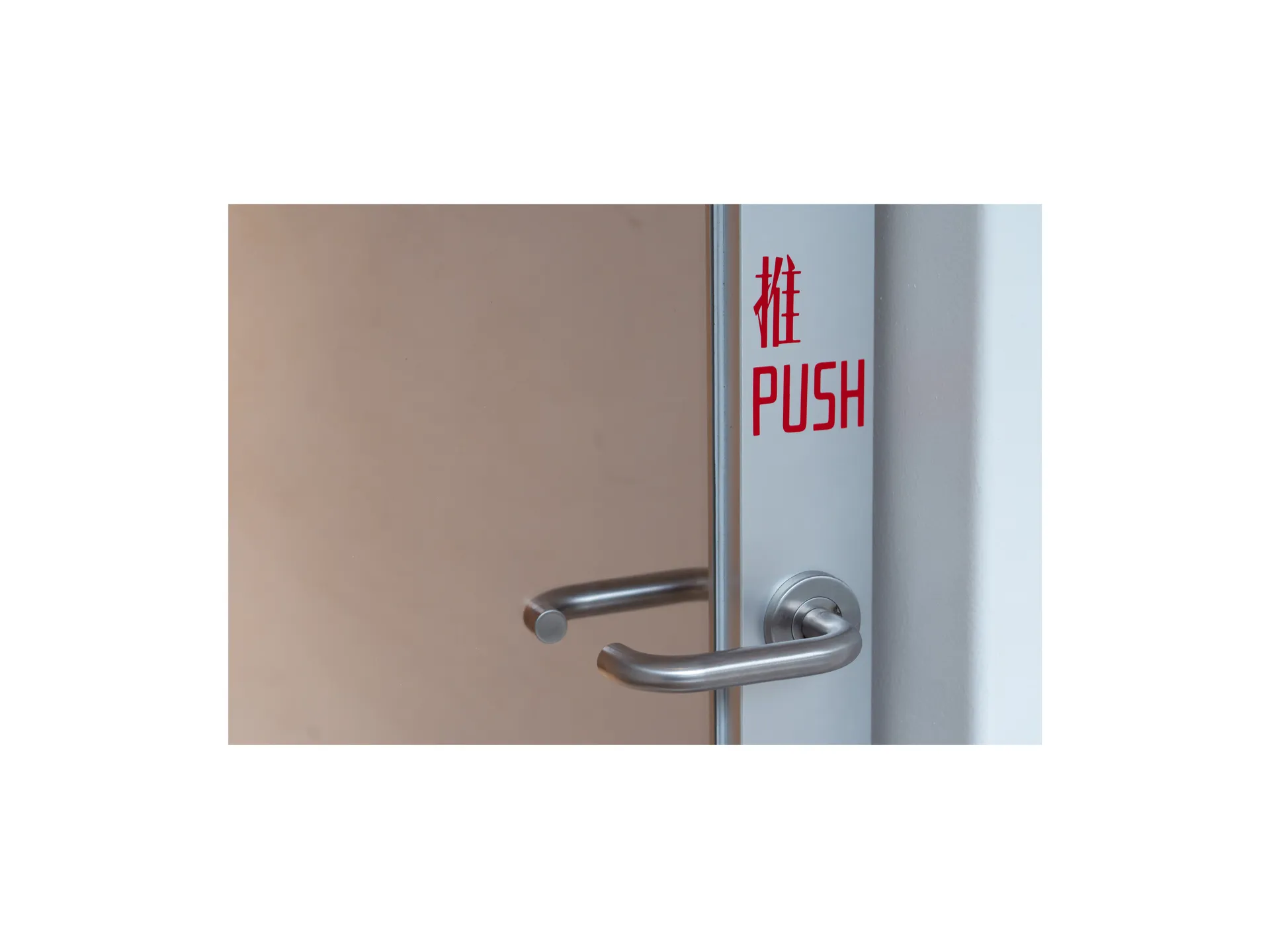
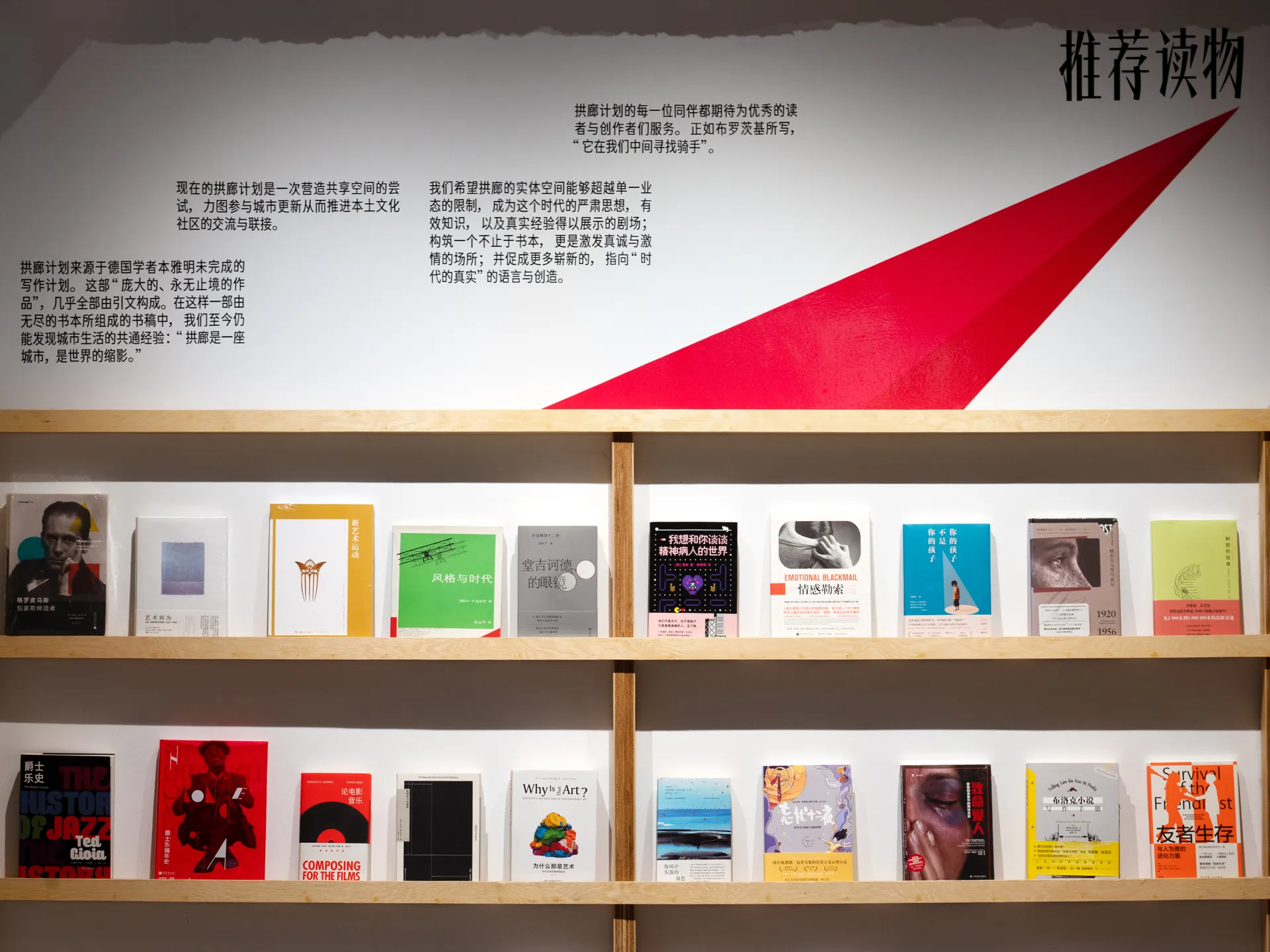
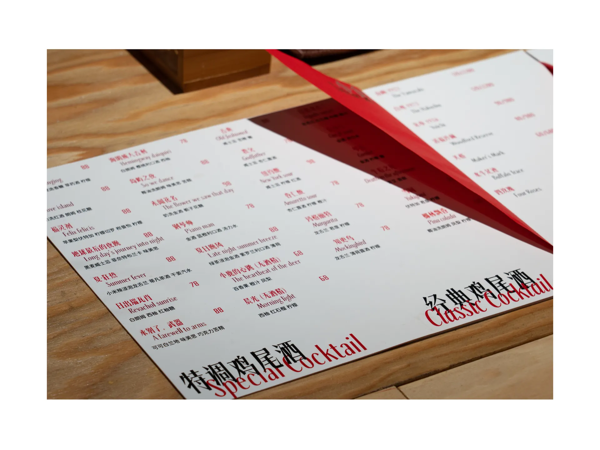
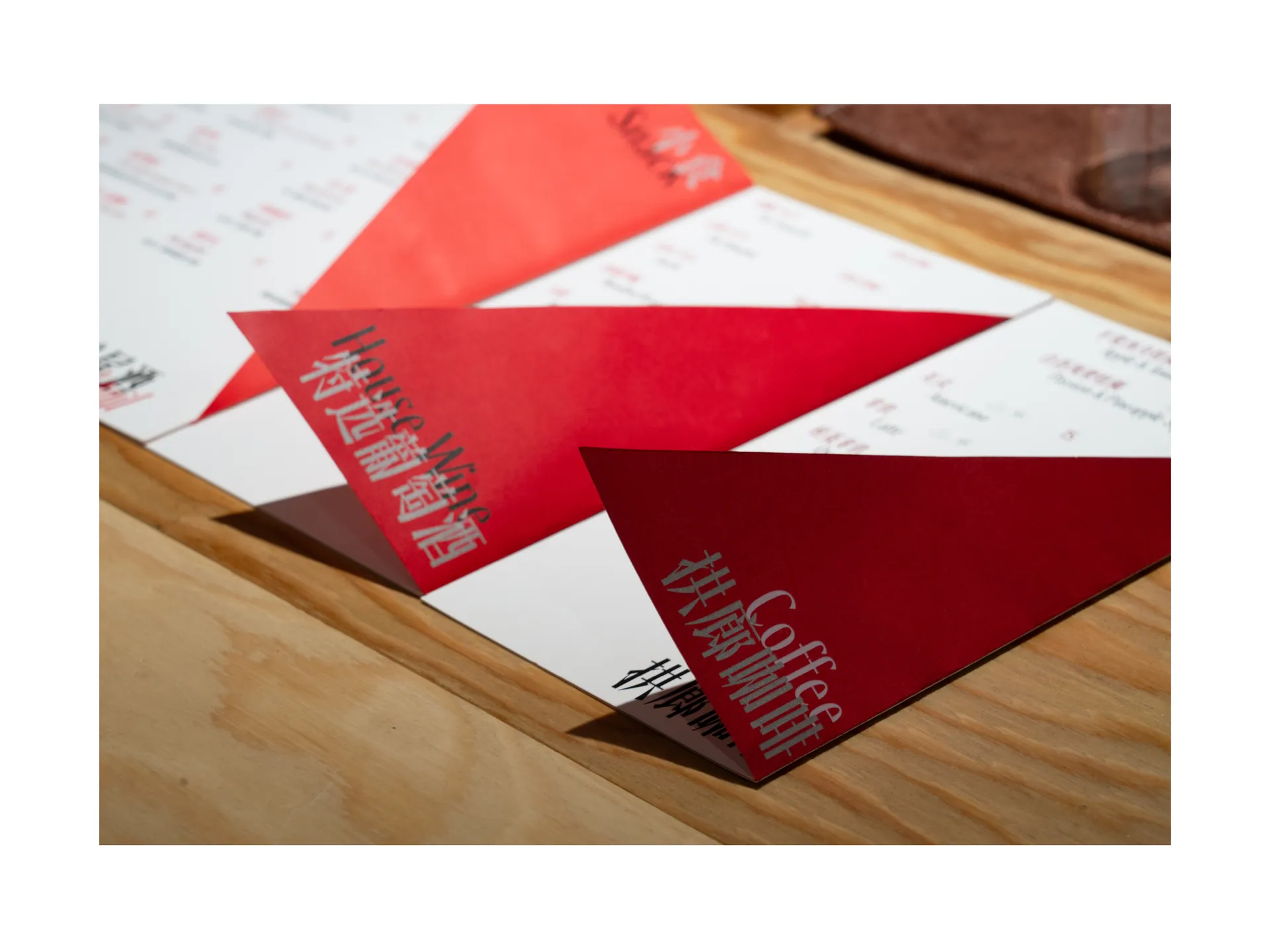
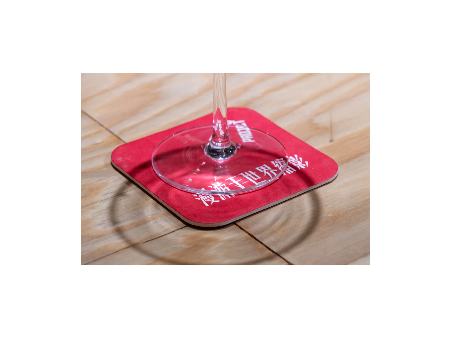
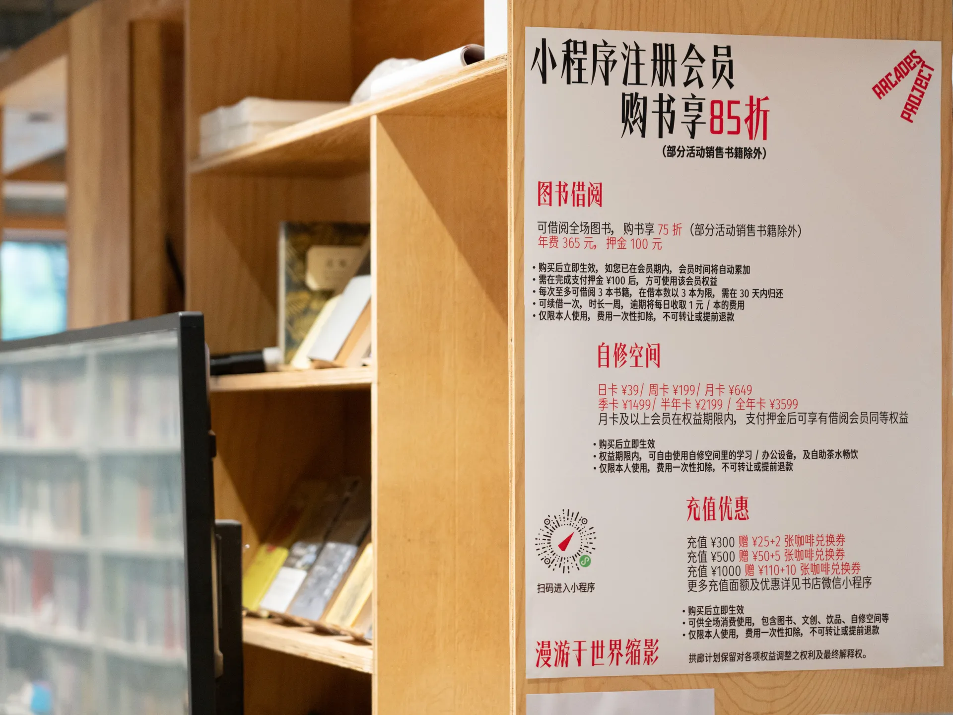
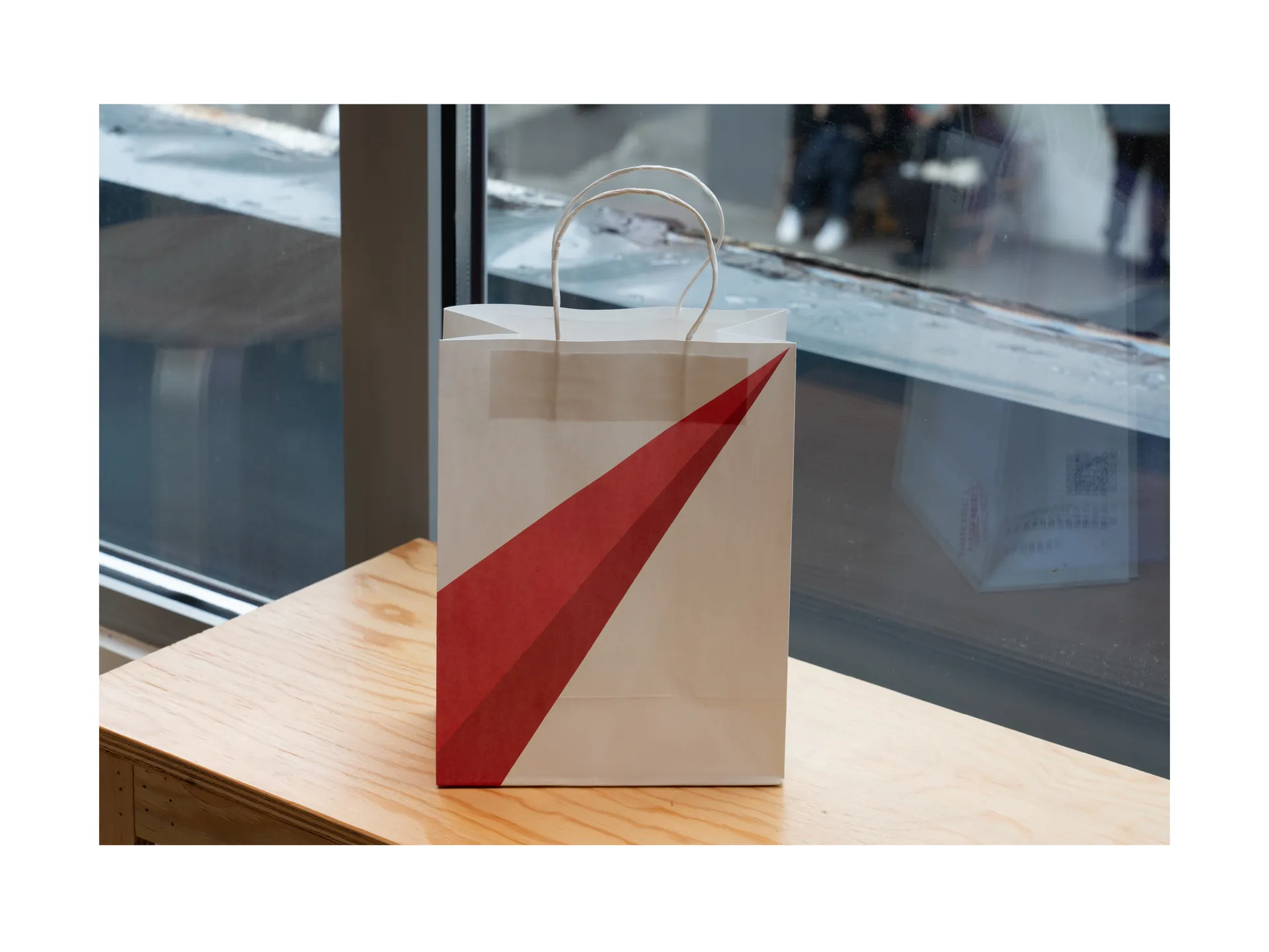
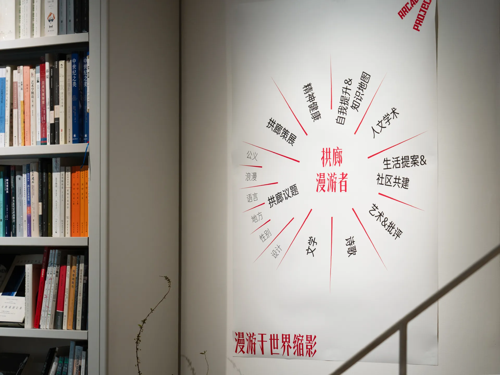
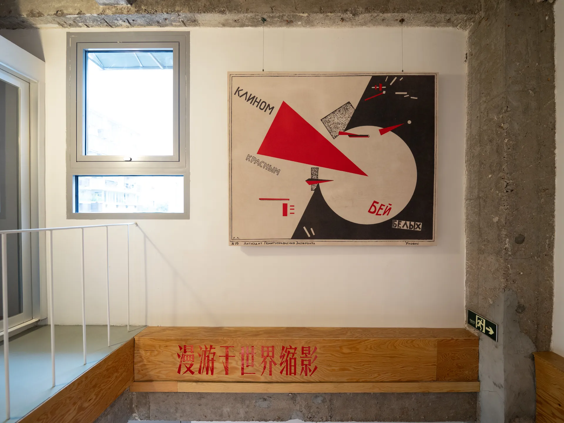
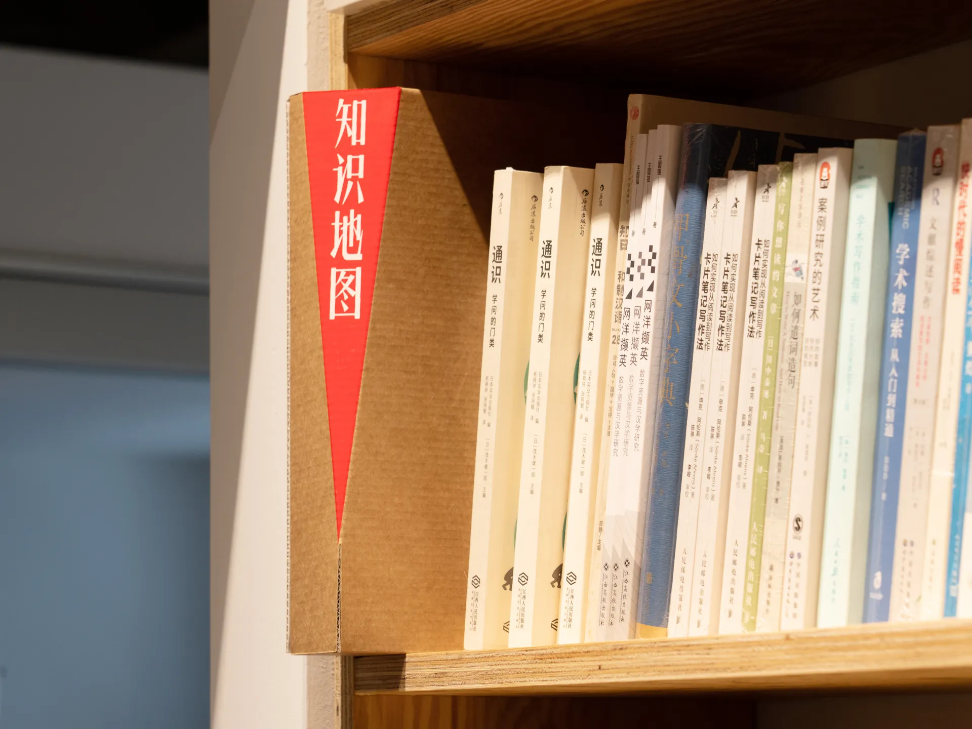
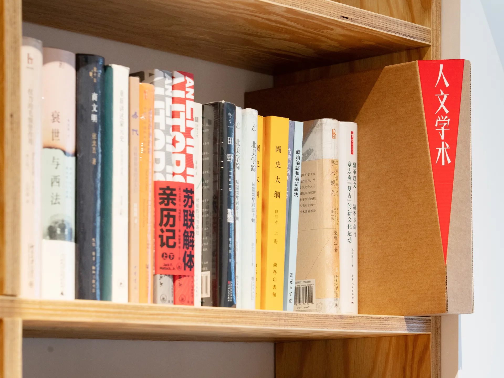
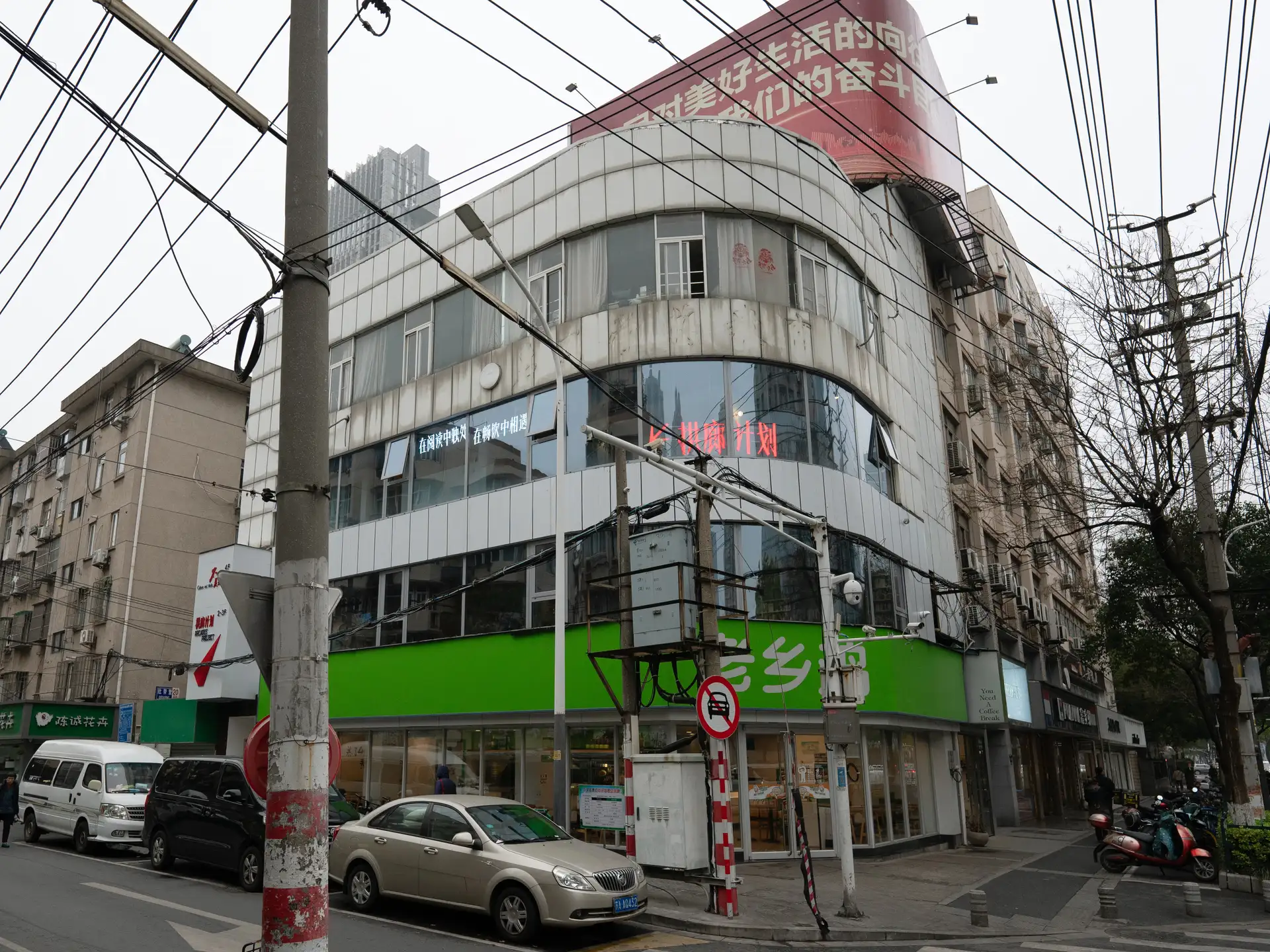
拱廊计划是一家来自南京的独立书店,主理人深受先锋派艺术的影响,希望拱廊的实体空间能够超越单一业态的限制,成为这个时代的严肃思想、有效知识、以及真实经验得以展示的剧场;构筑一个不止于书本,更是激发真诚与激情的场所。 以前苏联先锋派艺术家利西茨基的名作「红色楔子攻打白军」作为艺术风格,在字体上选取了由 atelierAnchor 锚坞开发的字库产品「会战宋」作为整个品牌识别的核心,在物料设计中大量运用与「楔子」相同的构成形式,立体的楔子被投射至物件之中、文字之间、平面之上,红色则作为主题色贯穿始终。将红色楔子「突破、构筑、指意性」的意向延伸至空间、平面以及线条之中。
“Arcade Project”, an independent bookstore in Nanjing, commissions our studio to build its branding strategy from scratch. Influenced by Soviet avant-garde art, the bookstore owner hopes the physical space of the bookstore can transcend the limitations of an otherwise singular business. The brand strategy is to turn the bookstore into a theater where serious thoughts, valid knowledge, and authentic experiences of our era can be presented. We take inspirations from the famous art piece “Red Wedge attacking White Army” by El Lissitzky and use it as an artistic reference for brand building. Typographically, our studio typeface “Sart Sans” is chosen as the core of the entire brand identity. Shapes and compositions similar to the “wedge” are extensively in various graphics and interiors; a three-dimensional wedge is projected onto surfaces of objects and paragraphs. Red is taken as the main theme color. The intention of the “red wedge” to “break through, build, and signify” is extended to the bookstore’s physical and graphic space.