Sart Gothic
Type design
- TD
- Willie Liu
- D
- Willie Liu
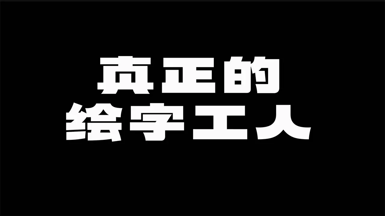
会战黑是对 1950–1980 年代新中国的手绘标语风格的实验性尝试,彼时新字形规范尚未彻底推行,繁、简、二简、异体字形同时存在,富有趣味。粗体部分的设计灵感来源于一幅 1971 年的美术字作品,细体则是原创设计,作为数十年后的一种回应。字体中使用 Opentype 特性来实现不同的字形。
Inspired by a 1971 piece of hand lettering, the style of the font Sart Gothic is an experimental throwback to Hanzi lettering of the 1950s–1980s PRC, where traditional and simplified Chinese characters (1st and 2nd round) randomly and interestingly coexisted. The light master is an original design, a “timely” answer of the designer in 2020s. The font looks heavy but not overweight, bold but not intimidating, fashionable but not cliché; it can be well used in display environments, especially in events, posters, showrooms, etc. Opentype alternative glyphs are deployed to accommodate different letterforms within a single variable font.